Ceefax
Rebuilding a broadcast-era interface for the modern web. Live football data wrapped in block colours, Mode 7 typography and just enough CRT glow to feel familiar again.
- Role
- Design & Code
- Year
- 2026
- Status
- Launched
- Links
- Site
Ceefax probably shouldn’t still feel this good.
Long before infinite scroll, push notifications and algorithmic feeds, information arrived slowly, one coloured page at a time. Football scores. Headlines. Weather. Page numbers burned into memory.
Gabe and I wanted to see what would happen if we rebuilt part of that experience for the modern web. Not as a museum piece, but as something genuinely usable.
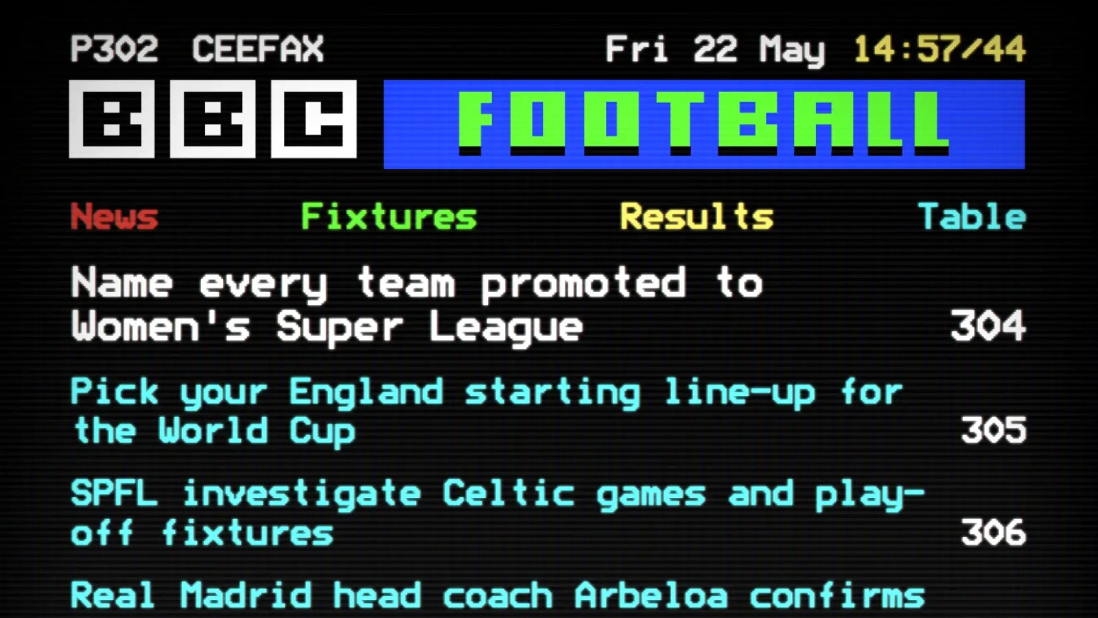
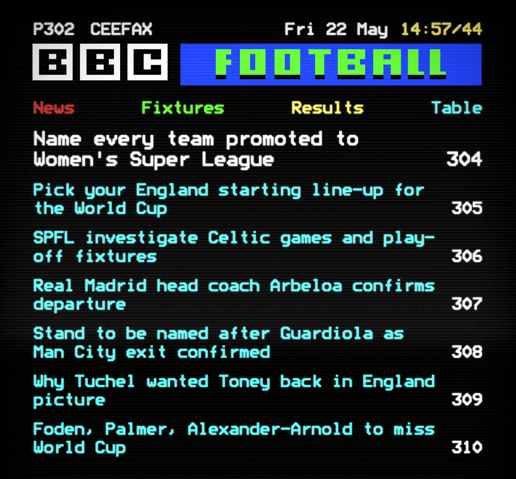
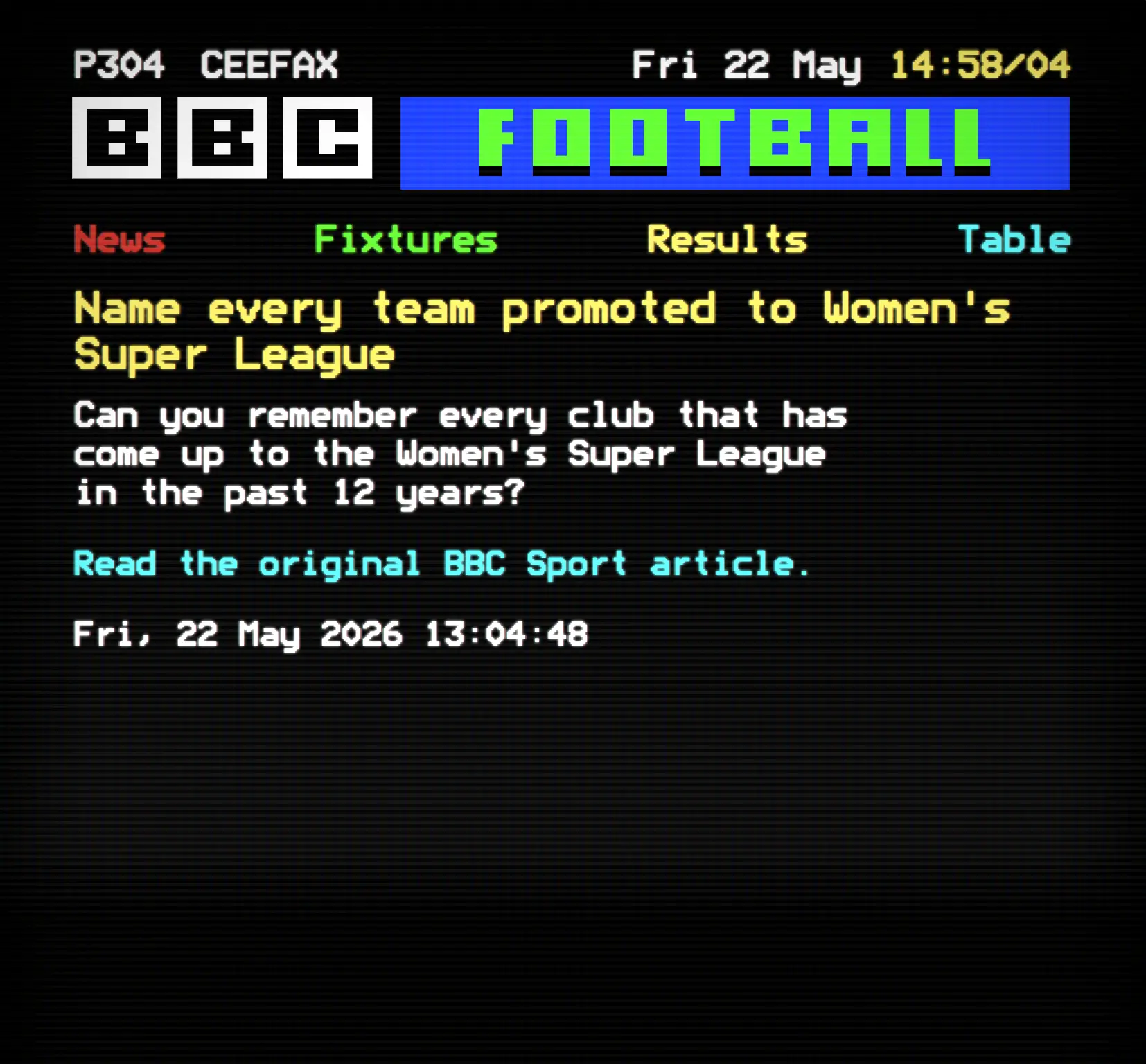
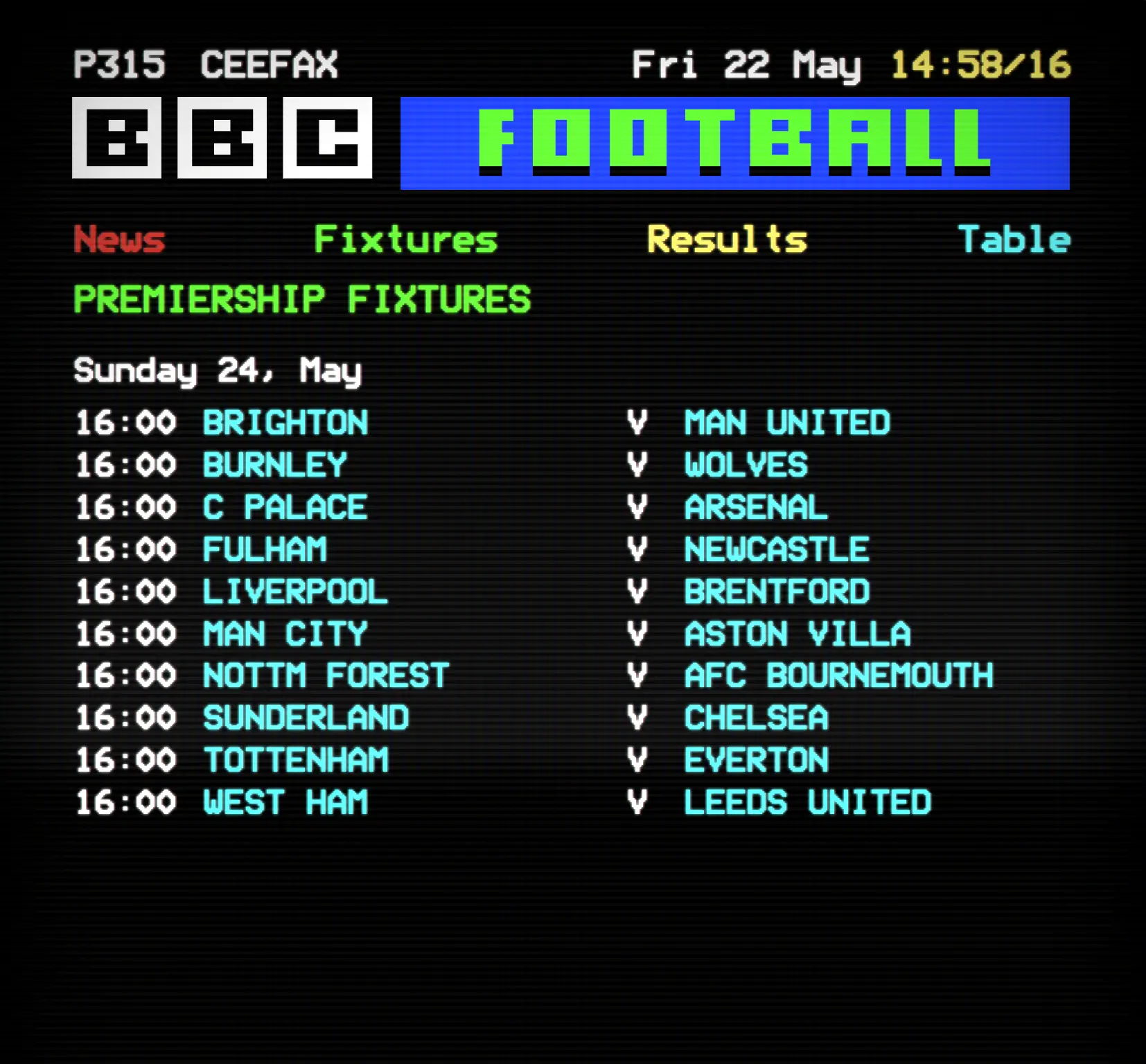
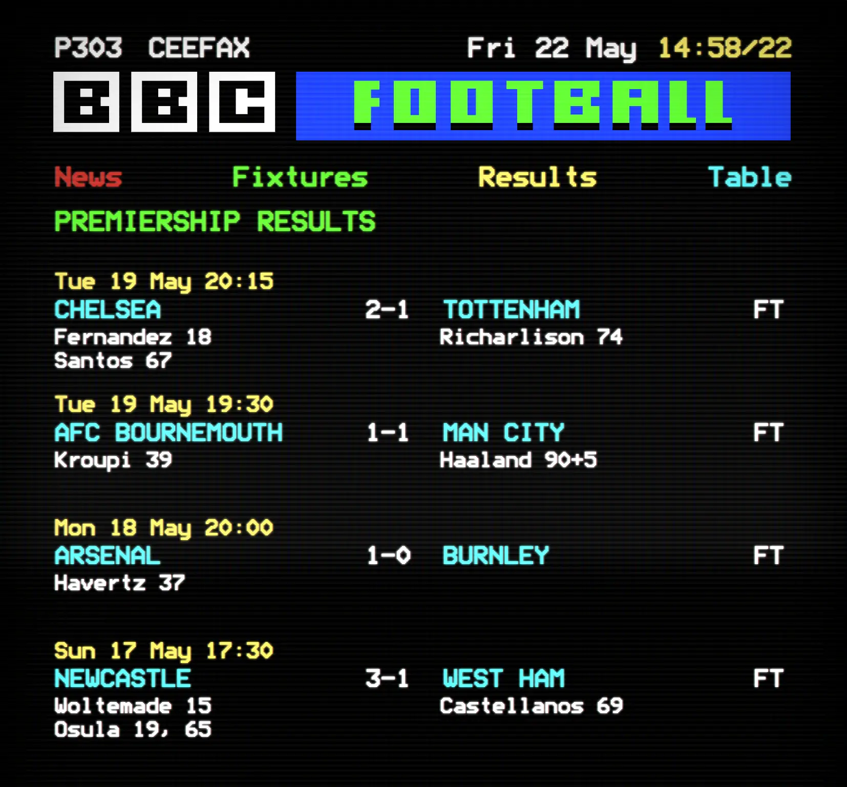
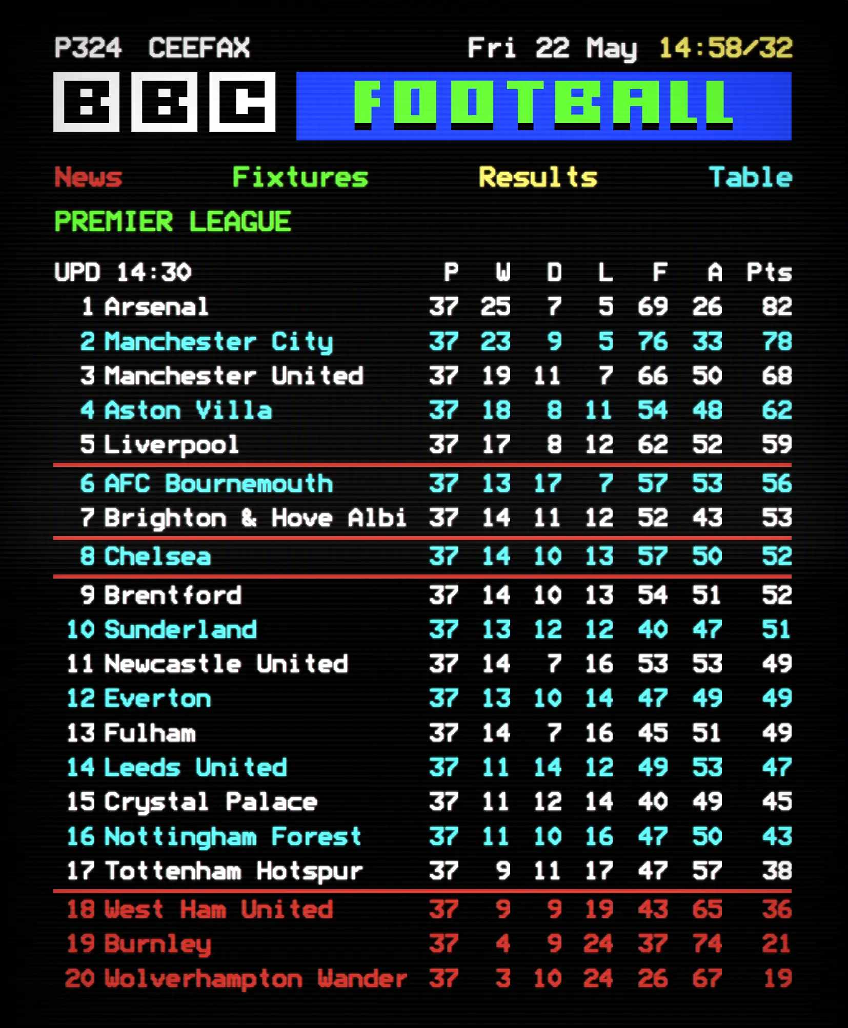
So we recreated the football section of Ceefax using live data from the Sportmonks Football API, wrapped in block colours, Mode 7 typography and just enough CRT glow to feel familiar again.
01
02
03
04
Old systems still have things to teach us
A lot of modern interfaces optimise for speed and efficiency. Ceefax was slower, stranger and far more constrained, but it also had clarity, rhythm and personality.
That was the interesting challenge.
Not simply recreating the look of Ceefax, but translating the feeling of it into something that works on modern devices without becoming frustrating or gimmicky.
We stayed close to the original visual language while taking liberties where it mattered:
- responsive layouts
- improved navigation
- modern frontend architecture
- real-time football data
- mobile usability
The goal was never perfect authenticity. It was preserving the character.
Recreating the football pages
The project focuses on the football section, powered by live standings, fixtures, results and scorers from the Sportmonks API alongside BBC Sport football news feeds.
Underneath the retro presentation is a fairly modern stack:
- plain HTML, CSS and vanilla JavaScript ES modules
- Tailwind via CDN with custom styling
- Netlify Functions running Node for API handling
- Netlify static hosting
- local ModeSeven typography for the classic teletext look
A lot of the work went into balancing limitation with usability. Teletext was never designed for responsive layouts or touch interfaces, so translating those interaction patterns to mobile without losing the spirit of the original became one of the hardest parts of the project.
Small details matter
Some of my favourite parts are probably the things many people will never notice.
You can navigate using page numbers from your keyboard, just like entering pages on a remote control. There’s subtle CRT treatment throughout the interface. Navigation intentionally carries a little friction. Certain layouts preserve the rigid structure of the original broadcast format even when modern design instincts wanted to “fix” them.
Those small details are what stop it feeling like a retro skin and make it feel closer to a remembered experience.
Reflection
Projects like this always end up being about more than nostalgia.
Ceefax represents a very different era of interface design. One shaped by technical limitations, patience and incredibly deliberate information hierarchy.
Rebuilding it was a reminder that older systems still have lessons for modern UX. Constraints create character. Simplicity creates clarity. And sometimes slower interactions become more memorable ones.
Mostly though, it was just fun seeing something from another era feel relevant again.